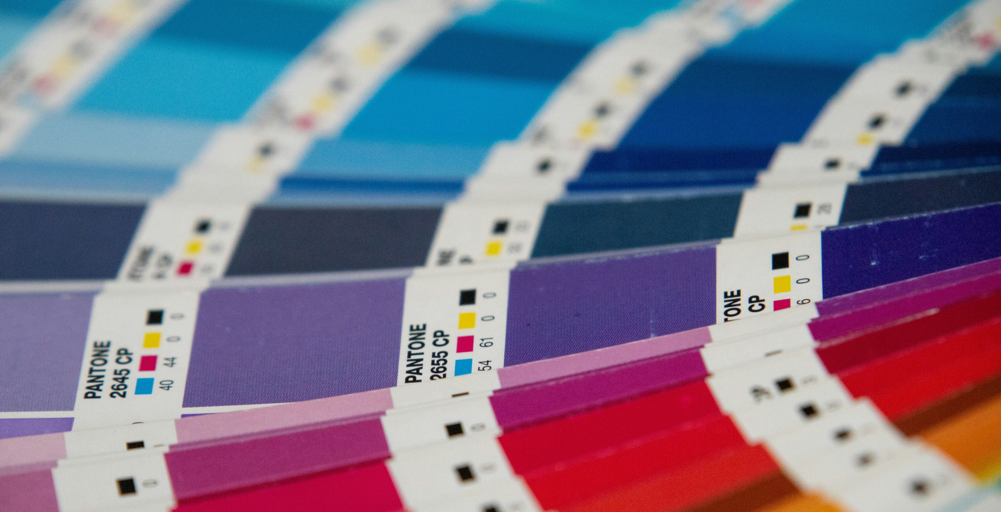
When people think about branding, they often focus on logos, slogans, or websites. But there’s another element working behind the scenes that influences nearly every first impression your brand makes. It’s color.
Color is not just decoration. It’s communication.
Before a customer reads your headline, explores your products, or learns what your company does, they’re already forming opinions based on what they see. The colors you choose can signal trust, excitement, luxury, reliability, creativity, or even caution. Get it right, and your brand becomes instantly recognizable. Get it wrong, and you risk creating confusion before the conversation even starts.
The psychology of color plays a bigger role in brand identity than many businesses realize. Learn how color psychology and marketing shape how people see, remember, and trust your brand’s identity. Find out what colors get the message across.
Why Color Matters in Marketing More Than You Think
People process visual information incredibly fast. In fact, research consistently shows that color has a significant impact on how consumers perceive products, brands, and experiences.
Think about some of the world’s most recognizable brands. You probably know their colors before you think about their logos.
There’s a reason for that.
Color creates emotional shortcuts. It helps people make decisions quickly and shapes how they feel about a brand, often without them realizing it.
That’s why color isn’t simply a design decision. It’s a strategic business decision.
What Different Colors Communicate
While cultural differences and personal experiences can influence color perception, the psychology of color tends to be remarkably consistent.
Blue Signals Trust and Stability
Blue is one of the most widely used colors in branding for a reason. It communicates reliability, professionalism, and confidence. Banks, healthcare companies, technology brands, and professional service firms often lean heavily on blue because it helps establish credibility. If your brand needs to build trust quickly, blue can be a powerful choice.
Red Creates Energy and Urgency
Red grabs attention. It’s bold, emotional, and difficult to ignore. Brands use red when they want to create excitement, urgency, passion, or action. That’s why it’s often seen in retail promotions, food brands, and entertainment marketing. The challenge, however, is balance. Too much red can feel overwhelming if it’s not used intentionally.
Green Connects to Growth and Wellness
Green is commonly associated with health, sustainability, nature, and growth. It’s a natural fit for healthcare organizations, wellness brands, agricultural companies, and environmentally focused businesses. Green often communicates balance and optimism, making it a versatile option across industries.
Black Represents Sophistication
Luxury brands have long relied on black to convey exclusivity, elegance, and authority. Used correctly, black creates a premium feel that elevates products and services. Used excessively, however, it can sometimes feel distant or intimidating.
Yellow Sparks Optimism
Yellow is energetic, friendly, and attention-grabbing. It can help brands appear approachable and positive. However, because it’s such a stimulating color, it’s often most effective as an accent rather than a dominant brand color.
The Real Goal Is Consistency
Many businesses get caught up trying to find the “perfect” color. But, the truth is there isn’t one. The most successful brands choose colors that align with their personality, audience, and positioning, then use them consistently across every customer touchpoint.
Color psychology and marketing messaging should be aligned across your website, social media, packaging, advertising, presentations, and signage; they should all feel like they belong to the same brand family.
Consistency builds familiarity. Familiarity builds trust. Trust drives action. That’s how color transforms from a design element into a business asset.
How the Wrong Colors Can Hurt Your Brand
Color mistakes rarely happen because a color is inherently bad. They happen because the color sends the wrong message.
Imagine a financial services company using bright neon colors typically associated with gaming or entertainment. Or a luxury brand using colors that feel inexpensive and generic.
The disconnect creates confusion. And confused customers rarely become loyal customers.
When your visual identity doesn’t match your brand promise, every marketing effort becomes harder. Your messaging has to work overtime to compensate for what your visuals are communicating.
Choosing Colors That Match Your Brand Personality
Before selecting colors, start with brand strategy.
Ask yourself:
- What do we want customers to feel when they encounter our brand?
- What qualities set us apart from competitors?
- Are we trying to appear innovative, trustworthy, premium, approachable, or disruptive?
- Who are we trying to attract?
The answers should guide your color decisions.
A healthcare brand and an outdoor lifestyle company may both use green, but for entirely different reasons. The context matters as much as the color itself.
That’s why the strongest branding efforts begin with understanding the business before designing the visuals.
Color Is Only Part of the Marketing Story
Color psychology is powerful, but it doesn’t work in isolation. Your typography, imagery, messaging, logo design, customer experience, and brand voice all work together to create perception. Think of color as one instrument in an orchestra. It can make a tremendous impact, but only when it supports the larger performance.
The brands that stand out are the ones that align every element around a clear identity and a clear purpose.
What Are Your Brand Colors Saying?
The best advertisers don’t leave first impressions to chance. They use color, design, and strategy to create instant recognition, build trust, and stay top of mind. When every visual element works together, your brand becomes more than something people see. It becomes something they remember.
At Brandon, we help businesses build bold, strategically driven brand identities that connect with audiences and drive growth. From positioning and messaging to visual identity and campaign execution, we make sure every element works together to create lasting impact.
Ready to build a brand that people recognize, remember, and trust? Let’s talk.
By subscribing to our newsletter, you agree to our Privacy Policy.